
In this article I am going to take you through the 8 mistakes I see business owners make on their website that are costing them sales.
The real question is…are you making these mistakes?
So, let’s get into it.
Table of Contents
Watch the video!
If you’d like to watch a video of this article on the 8 website mistakes that kill sales see below:

With the recent global issues there are lot of businesses doing it really tough so I decided to DO something about it and help some people.
I posted on Facebook an offer to review websites for FREE and provide valuable feedback on ways those business owners can improve.
I was absolutely inundated with requests for reviews. It’s really clear a lot of business owners are reviewing their websites and how to do better online because of all these global issues.
It was a great exercise but one thing was clear – people are making some key mistakes on their website that are costing them sales or leads.
So today I’m going to take you through the top 8 mistakes I saw.
I want you to check that you aren’t doing these mistakes on your website.
Mistake #1: Poorly defined Brand Benefit Statement
You know when you land on the homepage of a website there is usually a big headline that explains what the business does or something that is going on at the business like a sale.
Calendly does a great job of this with a clear headline like “Calendly helps you schedule meetings without the back-and-forth emails”
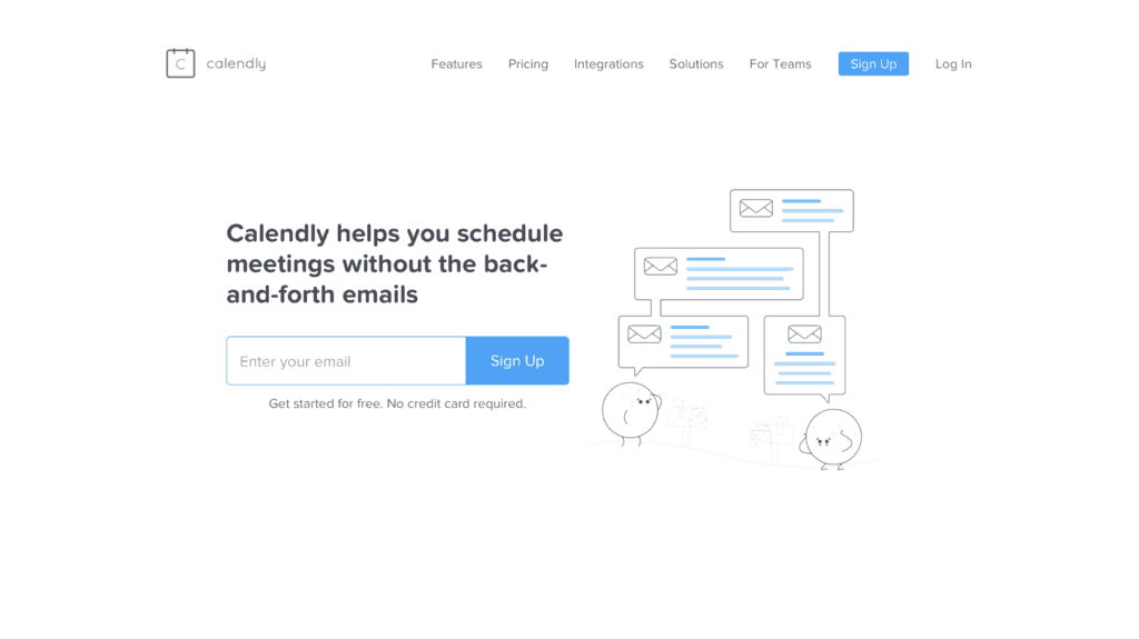
In less than 3 seconds someone new to their website will understand what Calendly does.
Unfortunately many of the websites I reviewed couldn’t give website visitors this clarity. In fact on many websites I had to spend quiet sometime working out what they did.
So how do you fix this? Here is a fast exercise I do with my clients to help generate a great headline. DON’T SKIP A STEP
Step 1: write down who your perfect target customer is. Write down everything you know about them like gender, age and other demographics.
Step 2: write down their hopes and dreams.
Step 3: write down their pain points or fears.
Step 4: write down what is unique about your business.
Now look at the pain points or hopes and develop one or two sentences that directly talk to these.
So if you look at the Calendly brand benefit statement you can see they directly talk to the customer pain point of the difficulty of setting up meetings.
As a special bonus, see if there is an opportunity to discuss how unique you are.
For example, someone who sells art online might say “Unique, hand crafted sculptures for eternity”. Put this on top of an image of your best sculpture and in less than 3 seconds customers get what you do and will check out the rest of your website.
All of this is about being really clear with what you do and how you help customers. It’s making sure you are clear about your brand and I cannot emphasise how critical it is.
If you aren’t clear on your brand you aren’t going to succeed in business.
If you’d like to learn more about brand benefit statements check out secret #1 in my post “10 Secrets to Designing the Ultimate Homepage”.

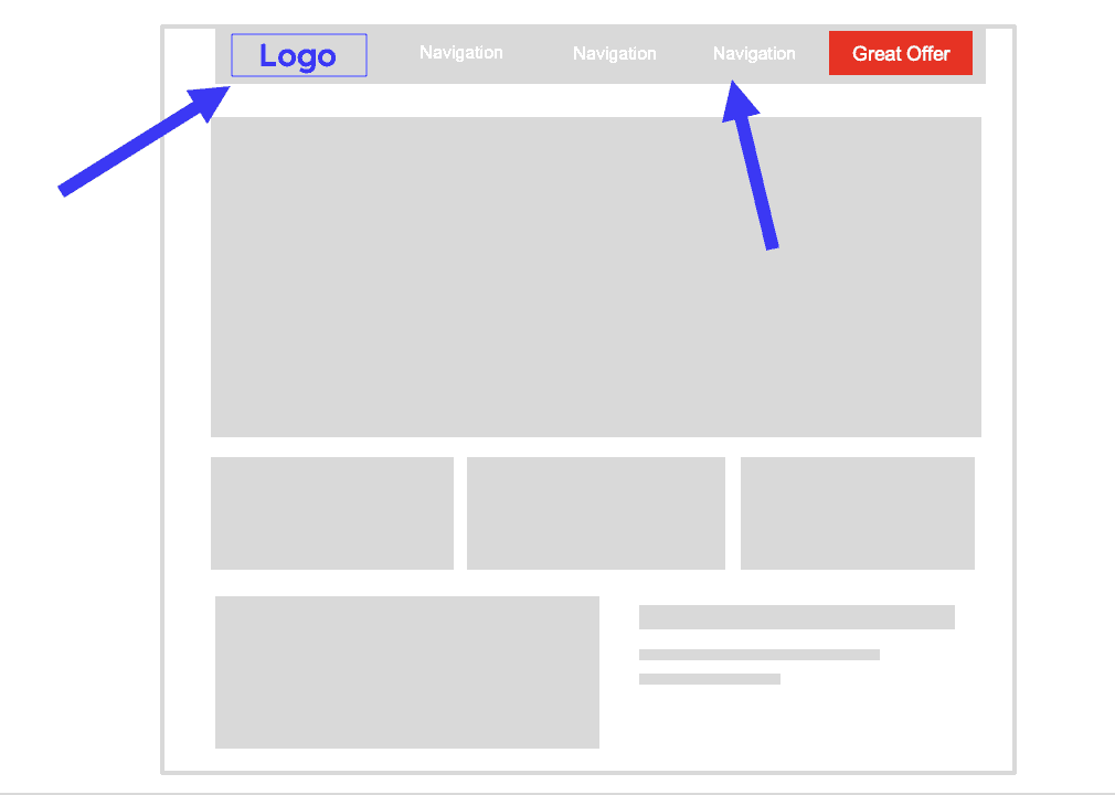
Mistake #2: No Great Offer
Often there was nothing.
You’ve got to have a great offer on your website because when someone is new to your website they are reluctant to take the first step and buy something or book a time with you because they don’t know, like or trust you yet.
Having a great offer is your opportunity to invite them into your business straight away.
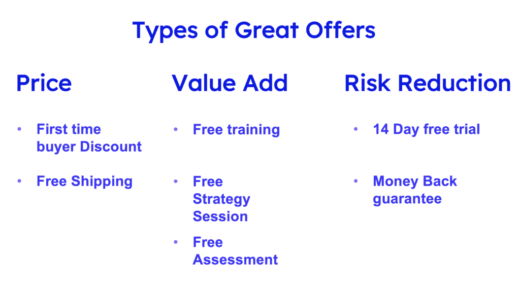
Now I call this a great offer for a reason – it’s got to drive them to do something NOW and not delay.
Think about a big first time customer discount, or a free service, or a free trial period.
It’s got to be awesome and if it’s an offer that addresses a fear or pain point it will do really well.
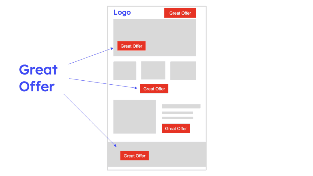
When you have this offer put it all over your website – not just one button in one place. Make sure people cannot miss it.
When business owners make these changes it’s amazing the impact this has on their results. DO it now!
Mistake #3: No Email Collection
Email marketing works so you have to get obsessed about collecting emails.
Founder magazine has at least 11 attempts at collecting an email address on their homepage.
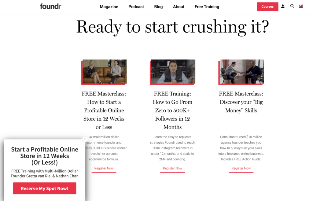
Also note that every one of their attempts offers VALUE for customers. They don’t just say “give me your email address”.
So get obsessed about collecting email addresses and I’ve got an article that describes exactly how to do this called “How to Build an Email List FAST”.
Mistake #4: No Blog Articles
The reason this is important is that a few well crafted articles that talk to a customers problem can do two things for you.
Firstly, they will help answer questions potential customers might have in your field of expertise.
Secondly they will help drive traffic from Google which is critical for your business.
Here is an example of blog articles on my homepage:
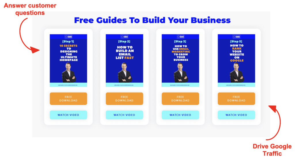
So think through the top 5 questions customers always ask you and write articles answering those questions. You’ll be amazed at how effective this can be.
I have an article on exactly how to do this step-by-step titled “How to rank Your Website on Google”.

Mistake #5: No Story
So many of these websites I reviewed were entrepreneurs who were so passionate about their business and what they do.
But they didn’t talk about it.
Humans LOVE a story so tell people why you do what you do.
Don’t fall into the trap of thinking it’s all about price. It’s been proven time and time again that emotion is so important when it comes to a purchase decision and telling your story makes you seem human and allows your potential customers to connect with you.
Do it. Put your story on your website.
Mistake #6: Poor Navigation
I saw so many websites that had a massive logo in the middle and weird navigation that was just so confusing.
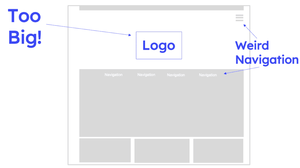
You’ve got less than 15 seconds to prove to a customer that you can solve their problem – don’t waste that time by having the customer not know what to do or where to go.
Stick to internet standards of logo in the top left and navigation across the top. Don’t argue. Just do it.
Mistake #7: Poor Mobile Version
50% of traffic on the internet is through mobile devices yet it’s clear people don’t spend much time checking how their website looks on mobile.
It seems so obvious but it’s a really common problem.
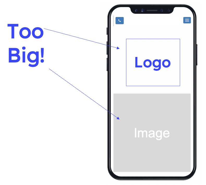
That mobile screen is really small so make sure you aren’t wasting that space with weird navigation or big images that push everything down the page.
Mistake #8: No Customer Reviews
The final mistake is not showing client reviews.
I saw so many businesses that had awesome customer reviews but they hid them on their website or, worse, didn’t even mention them.
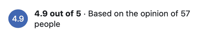
One business had a 4.9 out of 5 rating on Facebook and they didn’t talk about it on their website.
Put this all over your website and use some of the great quotes that clients often provide.
Social proof is so critical.
Wrap Up
So, there are the top 8 website mistakes I saw in over 50 websites that I reviewed.
Take action NOW. Check your website for these mistakes and fix them straight away.
It doesn’t take long or cost a lot of money to fix these but they can make a massive difference to your business.
Be sure you check out my free training titled “How to Turn Your Website Into A Marketing Machine in 6 Steps” for lots of tips on how to improve your website.
See you in the next article.