
In this article I am going to take you through the 10 secrets to designing the ultimate homepage.
Now these are Pro level secrets that I have honed after many dollars and years of testing and working with businesses to turn their websites into Marketing machines.
And I’m absolutely convinced, if you follow these strategies and execute them well, you’ll be able to achieve growth on your website.
So, let’s get into it…
Table of Contents
Watch the video!
If you’d like to watch a video of this post on the 10 secrets to designing the ultimate homepage see below:
Secret #1: Brand Benefit Statement
A brand benefit statement quickly tells website visitors what you do and the BENEFITS you provide.
The reason this is important is research by Chartbeat shows that when a customer lands on your website they will give you less than 15 seconds to prove you can solve their problem before they hit the back button and leave you forever.
Clearly explaining what you do and how you can solve their problems will greatly increase the chances of them checking out the rest of your website.
I’ve seen too many websites where their brand benefit statement just talks about themselves like “we are the best” or “we are number 1”.
There is just nothing in it for the customer.
Let me show you what good looks like…
Dollar Shave club is a perfect example of how they talk about the customers problem and how they can solve it right at the top of their homepage.
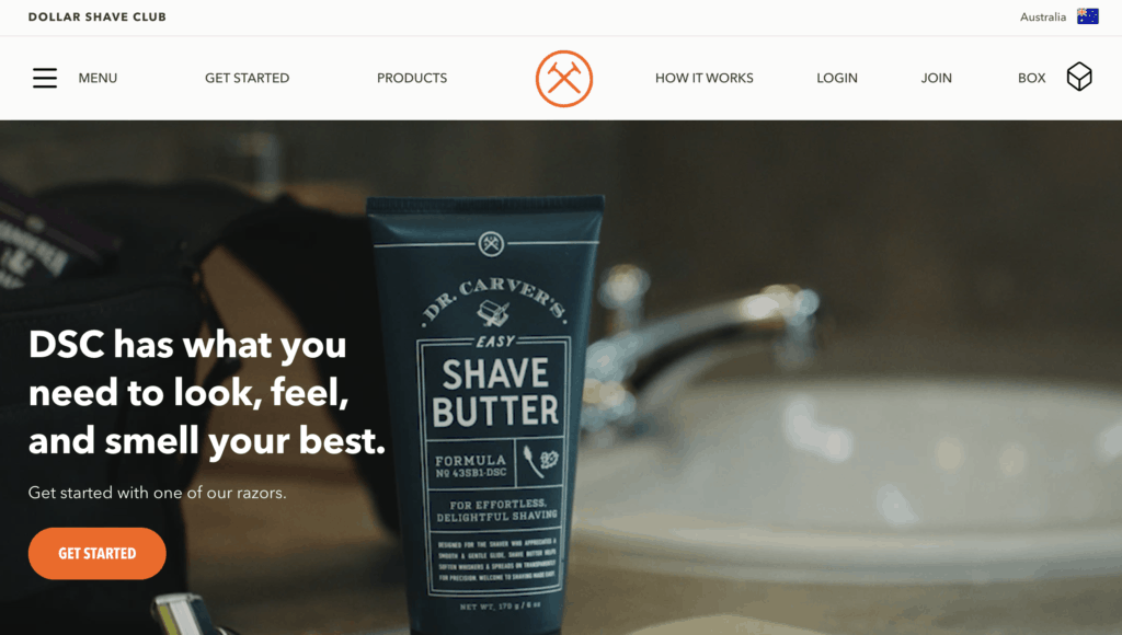
Dollar Shave club’s Brand Benefit statement says “Dollar Shave Club has what you need to look, feel and smell your best”.
They have clearly had a really good think about their customers, what those customers want and most importantly the problems those customers are trying to solve.
If you are new to Dollar Shave club you’ll quickly realize how they can help you and you’ll be encouraged to continue looking down the page.
Calendly is another clear example of a website that tells the customer what problem they are trying to solve and addresses a pain point.
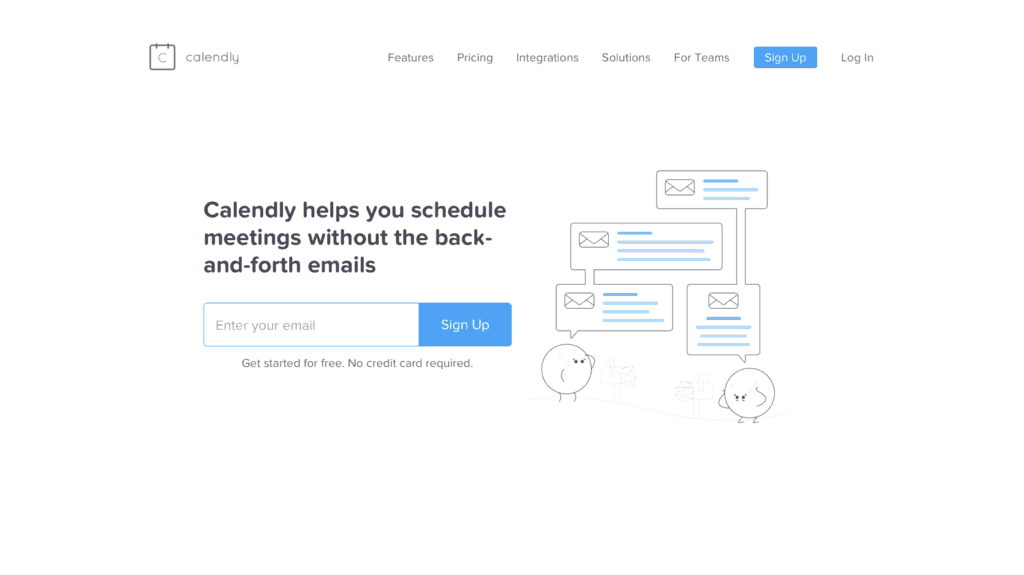
Their brand benefit statement is “Calendly helps you schedule meetings without the back and forth emails”. And if you have ever tried to schedule a meeting over email you know what an absolute pain that can be.
Well Calendly’s brand statement talks directly to that pain that customers know and feel. And when a customer reads that brand statement they will quickly identify with that pain point and read further down the homepage.
The final example is Joinhoney and they have a great customer value proposition where they help you find discounts on the products you are searching for.
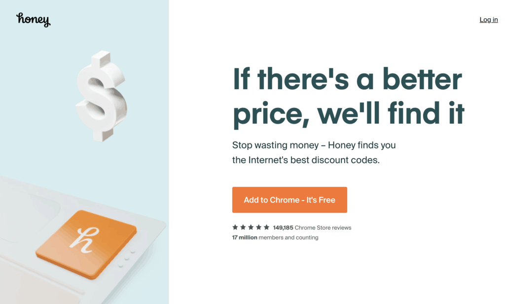
So, when they thought about their brand benefit statement they came up with something really powerful and it says “if there is a better price we’ll find it. Stop wasting money – Honey finds you the internet’s best discount codes”.
So really clear and simple. If a customer reads that they’ll know in less than 15 seconds that this website will help them find discounts on products they want to buy.
So, there are 3 clear examples of businesses who, when designing their website, thought about the brand benefit statement they want to put at the top of their homepage. These businesses wanted to make sure that, in less than a few seconds, customers will know what problem they can solve for them.
Do's and Don'ts of Brand benefit statements
Now, very importantly, when it comes to writing brand benefit statements, there are some do’s and don’ts.
Do's
Under the Do category, focus on a customer pain point. You want the customer to say “that’s the problem I have”.
Just like Calendly. Calendly’s brand benefit statement touches on a nerve with customers who hate doing the back and forth emails. It’s a pain point they have.
Use simple language the customer uses and very importantly, keep it short. Don’t write a big paragraph of text. Customers just won’t read it. It’s got to be one sentence or maximum two to make your point.
Don'ts
When it comes to the don’ts there are a couple of things you really need to be careful of.
The first one is don’t talk about yourself. Don’t say we are the biggest or we are number 1. Customer’s don’t care. It might make you feel good about your business, but customers don’t care.
Customers care about how you can solve their pain points.
The next one is don’t talk industry jargon or make it too complex. If you make it too complex people will just walk away from you.
And finally, don’t bury your Brand Benefit statement way down the homepage.
Put it right at the top of your homepage design so that as soon as people hit your website they instantly see what problem you solve and you encourage them to scroll further down the page to see what you have to offer.

Secret #2: gather customer data
You’ve got to get obsessed about gathering customer emails on your website. This must be an integral part of your homepage design.
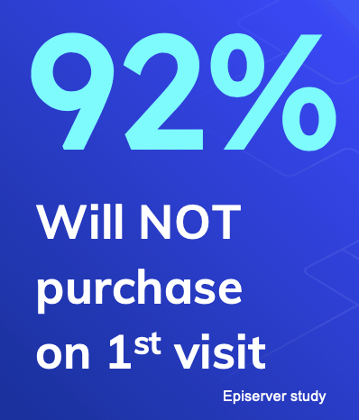
A really interesting fact is a study by Episerver showed 92% of first time visitors to your website won’t purchase on that first visit.
This means you must develop strategies to get that customer to come back and one of the best ways is to gather an email address so you can continue to communicate with them and encourage them to come back to your website.
Now, very importantly, I’m not just talking about gathering customer data via the good old “sign up to my newsletter” section – every website has that and, really, it’s not very effective. What we are talking about doing is inserting multiple methods through your homepage to gather customer emails.
But I’m sure your sitting there saying “yep, ok I get it I’ve got to gather email addresses but how do I do it”?
Well let me give you a few tips to do this.
The first tip is to offer customers VALUE in return for an email address.
You must offer customers VALUE in return for an email address.
David Katic, CEO & Founder, Digital Growth Genius. Tweet
Now what I mean by value is creating information that customers want. This is often called a “lead magnet”
So, as an example, let’s say you sold wine online or owned a shop that sold alcohol.
You could write a guide about “How to choose the right wine for the right meal”.
This guide clearly would address one of the problems many customers face when choosing a wine.
You could then offer this guide for free in return for an email address OR you could give free access to the guide and then offer a one page summary or checklist at the end of the guide that people could download and keep in return for an email address.
There’s also other methods of gathering customer data like quizzes, tools, calculators, even case studies that people are really interested in reading.
Provide some value – make it interesting and relevant to their pain point and customers will give you their email address.
The other really important benefit of taking this approach is that it shows customers what your expertise is.
Clearly if you understand how to match the right wine with the right meal you might know a thing or two about wine.
Let me give you a real life example of a business that is doing a really good job of gathering customer data while also integrating customer questions into their homepage design.
One of our clients is an outstanding financial advisor.
They know that when people come to them looking for financial advice there are 3 or 4 questions that are always asked.
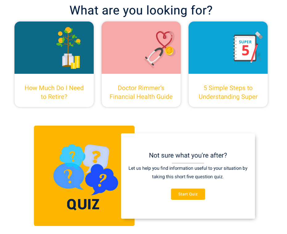
Well right near the top of their homepage design they put those 3 questions that everyone asks. How much do I need to retire, what’s my financial health and 5 simple steps to understanding super. Super is just like a 401k plan for retirement in the United states.
They also have a quiz where if you aren’t quite sure what you need but you know you need some financial help you can answer 5 short questions and it will guide you to the information you need.
This is a really effective way of adding value for customers by solving their pain points while also collecting customer data.
Alright, so now you understand that gathering customer data is really important and there are some really interesting ways of offering customers value in return for an email address.
But you might be saying to yourself how do I discover those questions they ask?
Well this is a simple process I use with businesses I work with that helps us figure out in less than 10 minutes the key questions customers ask.
Grab your frontline sales team and ask them the top 5 questions customers ask when they come into your business.
Now your website visitors are no different.
Take these 5 commonly asked questions and turn them into useful guides. Integrate these guides right up near the top of your homepage design, just below your brand benefit statement.
Ask for an email address in return for the guides or provide direct access to the guide but have a downloadable summary or checklist they can get in return for an email address.
Follow these steps and you’ll be gathering customer data in no time and also proving your expertise.
Secret #3: Segment & Filter
Now this is an absolute PRO level tip that most homepage designs just don’t even think about.
Let me explain…
Customers often have different reasons to come to your website
Often these reasons require all sorts of different messaging, but you can’t put all these messages on your homepage because it would make it too cluttered and complicated.
You need to find a way that allows customers to easily identify the problem they are trying to solve and then direct them to pages on your website that solve that specific problem.
Let me give you some examples to show you what I mean.
Bank Example
Imagine if you ran a bank website.
Now clearly when you think about a banks website there are lots of mission’s customers are trying to solve when they are on the website.
They might want to do internet banking, they might be looking for a home loan, savings account or ways to reduce debt. These are all very different reasons to come to a banks website and you need a way to quickly allow customers to get to the information they need.
Well Westpac have thought through how to segment and filter these customers really quickly to get them to where they want to go fast.
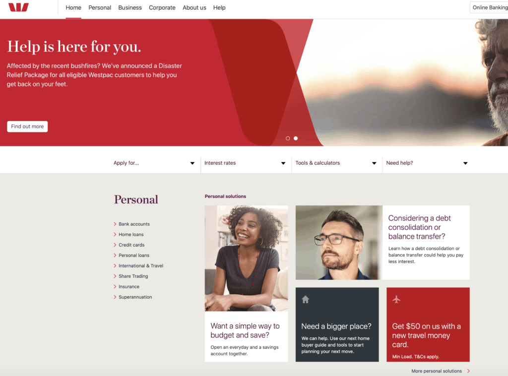
If you look on Westpac.com.au just below the first section they have “want a simple way to budget and save”, “considering debt consolidation or balance transfer”, “need a bigger place?”
They have clearly thought through why customers go to their website and they are trying to help those customers get to the information they need fast.
This strategy of segmenting and filtering works really well to help maximize conversions which means more revenue for your business.
Multivitamin Example
Another example is New Chapter. They are a company that sells multivitamins.
Now as you can imagine, if you sell multivitamins there are all sorts of different customers. There’s men, women, younger people, older people, people with all sorts of different health conditions.
So it’s very difficult to construct a homepage that quickly filters people towards the information that’s relevant to their health situation.
Well they came up with a really clever way to combat this problem by asking a series of questions that allows customers to identify their current situation and then directs them to the multi vitamins they should consider.
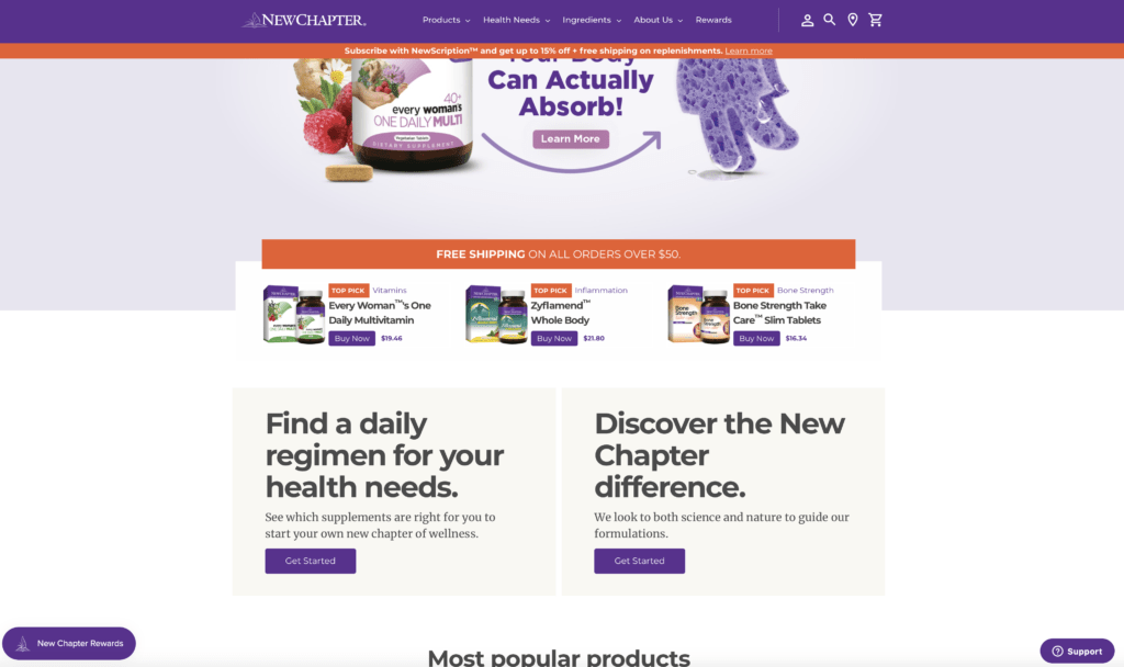
Just below the top of the homepage there is a section that says “Find a daily regimen for your health needs. See which supplements are right for you to start your own new chapter of wellness.”
If you click on that section it segments and directs you to the vitamins you need (see below).
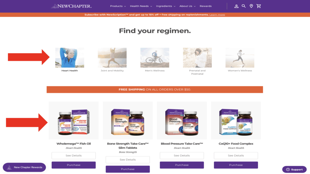
This is a really effective strategy to improve conversion and I know it’s worked very well for this website.
The final example is the financial advisor website we discussed earlier.
If you complete the quiz on the homepage the quiz quickly delivers the information you need that’s relevant to your topic of interest.
So quizzes are a really effective way of segmenting and filtering customers so that can get to the information they need fast.
So, think about the key reasons people come to your website and find strategies to “Segment and filter”. Integrate these strategies into your homepage design.
If you do this well you will significantly increase the conversions on your website.
Secret #4: Authority & Expertise
Customers want to know your credentials. You may have convinced them that you know how to solve their problems, but they want to know if you really have the expertise to give them the solution that they need.
So share your experience and qualifications in your homepage design that prove you can solve their problem.
Also, carefully select images that prove your authority and expertise.
For example, an image of you on stage or an image of you actually doing whatever it is you do. Images are a powerful way of proving your authority and expertise.
If you look at Tony Robbins’ website he has great examples of this where he shows himself presenting in front of thousands of people.

And this very subtly gives even more credibility to Tony Robbins. Imagine a customer looking at the homepage and they see this person presenting to thousands of people.
Sublimely they will think that this person must know what they are talking about and can help solve their problems.
If you don’t have images simply tell people your experience. For example, you may have 25 years experience in an industry or you spent X dollars on a certain topic solving it and you’ve really mastered it.
Whatever it is convince people that you are an expert in your field.
The other really important benefit of doing this is that it helps with your google search rankings because google takes notice of authority and expertise in certain areas.
Secret #5: Social Proof
Show how you have made a real difference to people just like them.
Your homepage design must include your google reviews, online product reviews, client testimonials or the number of customers you have helped – anything you can do to prove that you have helped lots of people in their situation.

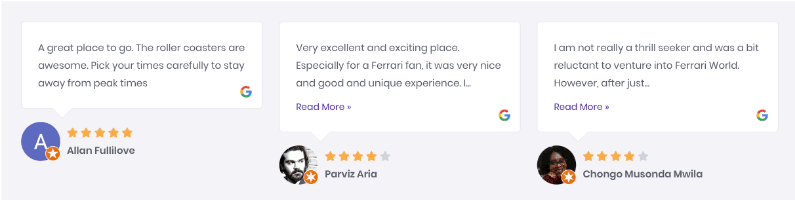
And these are all ways to build credibility and convince people that you can solve their problems.
Secret #6: Scarcity
Now studies show that humans worry about missing out.
FOMO or fear of missing out is absolutely a real thing.
So, integrating offers into your homepage design “limited time”, “limited spots”, “until sold out” is a really effective way of getting people to take action.
The Wall Street Journal recently had a time sensitive promotion with a great offer of $1 for a 2 month subscription.

It’s a really powerful offer and it was only for a few days over the black Friday / cyber Monday weekend.
Now very importantly, make sure that your scarcity offer is genuine otherwise people will lose trust in your brand because it doesn’t sound very real.
These strategies, this idea of scarcity, drives people to take action now and not delay.
Secret #7: Story
Humans like to identify with other humans especially if it’s a story about someone else in a similar situation that they are in right now.
So, tell your story, think about a story in your life or a story where you have worked with another customer that will resonate with the people you are targeting.
Now my personal story here, and the reason I started Digital Growth Genius is that one day I sat across from a business owner who was really frustrated that they knew digital was a great opportunity but they just couldn’t get the right advice to help grow their business.
And that was quite literally the day I decided to build digital growth genius to help business owners work out what they need to do to grow.
So you need to tell the same sort of story. What’s your story and how can it resonate with the customer.
You don’t need to put the whole story on your homepage but touch on it and link to it and I guarantee you people are really interested in these things and they will click on the link and read the full story.
My about page is one of the most trafficked parts of my website.
Secret #8: Process
This is another really important one.
Consumers with problems aren’t sure what to do and they get lost in the complexity of the situation.
Well the interesting thing about us humans is that we love being shown a step by step solution to our problem. This is because we find great comfort in knowing that if we follow these few steps, we can solve the problem.
So, it’s really important on the homepage of your website that you outline a clear and simple process to engage with your business.
Critically, keep this process to around 3-5 steps.
Let me give you some examples.
Dollar Shave Club have done a great job of explaining the process that they put customers through to solve their problem.
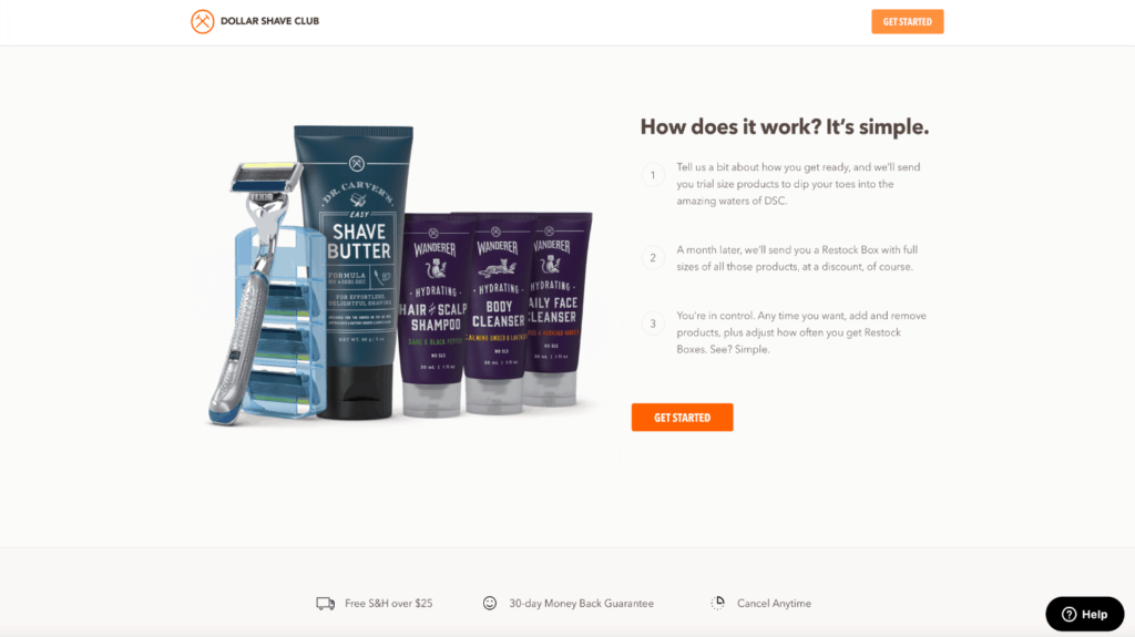
You can see above they outline a 3-step process on how they work with customers to solve the problems they have.
Really clear, really simple and puts the customers at ease on what the next steps are.
Another example is Calendly.
They have done a great job with a really good benefit statement at the top of the homepage design and right below that they have a section on how it works.
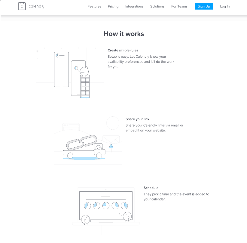
And it’s a three-step process on what you need to do to solve that problem when it comes to booking meetings with clients.
A great example of explaining a process and how to solve a customer’s pain point.
So, think about a simple summary of how you work with your customers…
Summarize it in 3 – 5 steps and put it on your homepage in a great spot so that people immediately get put at ease knowing that this is the process that I’ll go through to solve the problem that I have got.
Secret #9: Great Offer
Remember that statistic I gave you at the start that said 92% of website visitors don’t buy the first time they visit your website. Customers are often reluctant to take that first step to engage with your brand.
Having an outstanding offer is an integral part of a dedicated strategy on your website to conquer this initial inertia, that initial hesitancy that customers have in dealing with a new business.
So what you need to do is come up with an irresistible offer that customers just say WOW.
Now very important here is to keep that irresistible offer focused on the customer pain points that you have been talking about through your homepage.
Some examples include free consultations with senior leaders in your business, if you sell products you could offer ”first one free or 50% off your first purchase”.
Make it an absolutely irresistible offer that they just can’t walk away from.
A really great test that I encourage everyone I work with to consider is to ask if the irresistible offer you have come up with is twice as good as any of your competitors.
So, keep your homepage heavily focused on this great offer and make sure you show it in multiple spots right throughout your homepage so customers simply cannot miss it.
Remember, the goal is to get the customers to take that first step to engage with your business through this amazing offer.
Here is an example of a great offer from a Dentist.
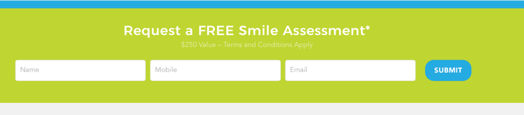
They simply say “Request a FREE Smile assessment $250 value”.
This is a great offer that I know absolutely works because it focuses on a pain point – the customers smile – and it takes all the risk out of the process for the customer. They literally have nothing to lose and it can be a great source of new leads for a business.
So, think about that great offer and what you can put on your website to get people to take that first step with your business.
Secret #10: key design principles
The final secret is following key design principles and there’s 3 that I am going to focus on here.
Navigation
The first one is navigation and you’ve heard me mention before that you have less than 15 seconds to impress a customer when they land on your website for the first time.
Don’t waste that precious time with navigation that customers just haven’t seen before.
Keep your navigation consistent with the majority of the internet.
That means logo in the top left, navigation across the top, drop down boxes, large footers,
Keep it consistent so customers quickly feel at home and jump straight into trying to solve the problem they have.
Space
The human mind hates clutter and if you make your website cluttered and confused customers will just hit that back button and run away from you really quickly.
So keep lots of open space, keep it clear and simple so you keep the user focused on what you want them to focus on.
Calendly and Dollar Shave club are perfect examples of incredible use of white space to keep the messaging clear and simple.
The final key design principle is limiting choices.
Now it’s been proven time and time again in lots of consumer studies that when you present customers with too many choices they back off and elect not to make a choice.
I know you are passionate about your business and you want to talk about the 15 or 20 different products or services you provide. The problem is that if you do that on your homepage you run the serious risk of confusing people resulting in them electing to not make a decision and leave your website.
So stick to 1, 2 or 3 messages or 1, 2 or 3 products
Importantly, if you use the segmenting and filtering secret I discussed earlier you’ll be able to show all your products and services to the right person at the right time rather than just dumping them all on your homepage.
Wrap up
So, there you have it, the 10 Pro level secrets to designing the ultimate home page.
I have a developed a summary of these 10 Pro level secrets you can download here.
Now this video is step 1 in my series on how to turn your website into a Marketing machine in 6 steps.
In step 2 I discuss how to build a customer database – something that you MUST get started on straight away in your business.
You can see the whole series by following this link.
See you in the next article.