“I just don’t seem to get any leads from my website”
That’s what I have been hearing a lot lately.
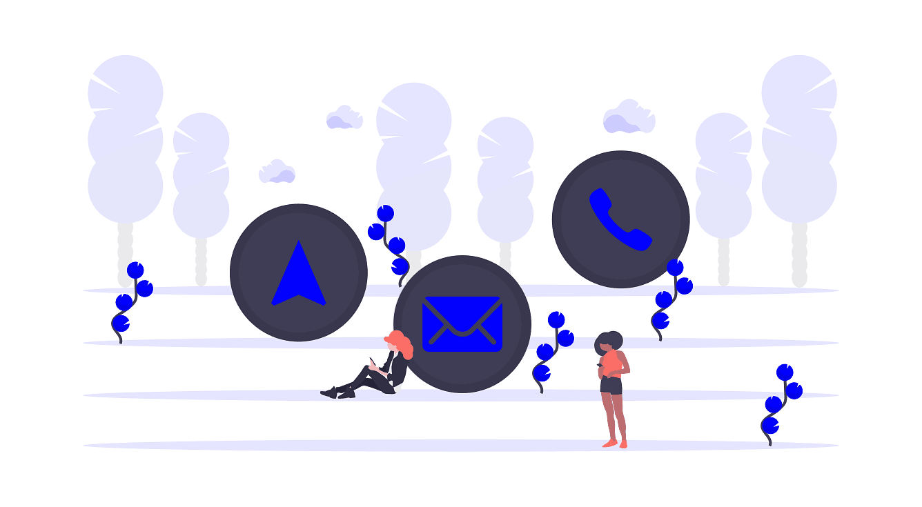
I have done a lot of work with financial planners recently and this is their number 1 frustration with their digital efforts.
They quickly ask me to review their website and advise what they need to do.
Generating sales or leads from your website is a really big topic but as I review these websites there is a common cause of the problem.
Their digital agency has prioritized design over conversion.
It’s a trap that most fall into.
It’s easy to get seduced by beautiful images that take priority over providing a good journey for the customer.
While you want your website to look visually appealing it’s useless if you don’t have multiple mechanisms to convert that traffic into a customer.
In the battle between design and conversion I know who wins at Amazon.
You’d never describe Amazon as a beautiful website. But they certainly know how to help the customer find the right product FAST. And sell.
Let’s start off with some definitions.
When I say “design” of a website I’m talking about the colours, images, look and feel. Essentially the aesthetics.
I define “conversion” as the ability of your website to convert your traffic into sales, leads or other revenue generating goals for your business.
Many digital agencies prioritize design over all else. They start a new website project with a discussion on colours, look and feel rather than conversion.
And that’s where the focus stays right throughout the project.
So, what’s some real examples of how this obsession with design causes a severe drop in conversions:
Problem #1: Home page Image.
Many websites have an image at the top of the home page. No problem with that.
The problem is that these images are often so big they push the content from the next section below the screen. So, when the customer hits the home page all they see is one big image.
Now this can be fine if the image is very relevant to explaining what the business does and has a headline or button that really guides the user to the next step. You always want to be pushing a customer along to the next logical step.
But that is often not the case. All the customer can see is a beautiful image with a useless headline and nothing encouraging them to go to the next step.
Here is an example of what I mean. I have blocked out the logo to protect the innocent.
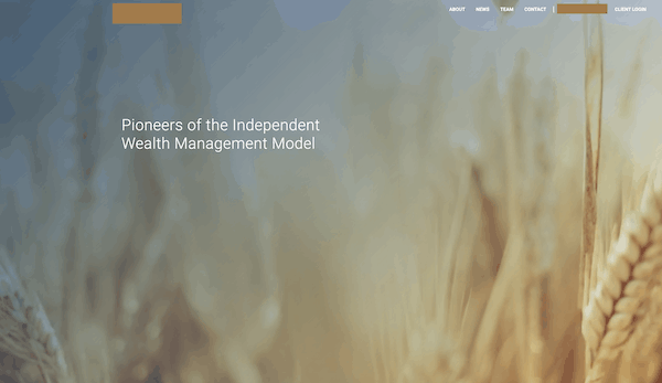
That image takes up the whole screen with just a headline that doesn’t encourage the customer to do anything.
Here the strategy is to hope the customer scrolls down.
To make matters worse, this was actually a video of a camera moving through a wheat field. Not sure how that is relevant to financial planning but certainly a triumph of design over conversion. That video would have also slowed down the load time of the home page.
Some website designers feel so guilty about this they put a down arrow at the bottom of the image that attempts to encourage the customer to scroll down.
It’s ridiculous.
Here are some golden rules for the top of your home page:
- It’s fine to choose an image but make sure it is relevant to your topic.
- Put a headline that combines what you do with a benefit for the customer.
- It’s completely ok to have some sub headlines that further expand on this but don’t fall into the trap of having blocks of text. See more on this later.
- A button to encourage the customer onto the next step is also important. It would also be great if you can just see the top of the next section on your home page. This will encourage the user to scroll down. This can be difficult with a multitude of screen sizes but keep this in mind.
Problem #2:
Second Section on Home page is block text or a basic “this is what we do”
It’s seems like an obvious next step to just list out what the business does. The problem is that it’s often full of industry jargon rather than clear customer benefits.
I’m a little fanatical about the section immediately below the home page image.
My strong preference is to have your most relevant content that users can immediately read.
Very importantly, offer pdf downloads (lead magnets) with summaries of the article, checklists, infographics or case studies.
Anything that adds value for the customer in exchange for an email address.
As an example, a Financial Planner might have an article titled “How much do I need to retire?”. It’s highly relevant to someone on a financial planning website and it answers one of the key questions that people have.
Have 3-4 of these types of articles/downloads right below the home page image.
There are two very strong benefits of this approach.
Firstly, you provide value to the customer and they start to understand the services you can provide. See the subtle difference between a list of your products and services and a value add article that also ends up explaining what you do?
Secondly, you collect an email address that allows you to start a dialogue with a customer to generate a lead.
A really good alternative for this second section is an area that describes the process you take customers through. This must end with some sort of offer. For example, a Financial Planner might describe the process they use with their clients and then offer a free financial health check.
Either way leads the customer to understand what you do. And you get a lead!
Everyone is a winner.
Much better than a boring list of what you do.
Problem #3: Limited Credibility or authority
I see a lot of business owners who have appeared on TV shows, published articles in major newspapers, received great reviews or helped thousands of people.
They bury these great achievements on a webpage that is hard to find!
You should always put as much proof of your credibility and authority on the home page.
Customers are trying to work out what you do and if you can solve their problem. These sorts of credibility statements are absolutely critical to building rapport with customers who have never heard of you before.
Don’t hide it or think you are boasting. Your website needs to get people to know, like and trust you. Adding credibility and authority to your home page can seriously help with this.
Problem #4: Blocks of Text
I see this a lot. Big blocks of text throughout the homepage.
It’s really important to understand that paragraphs of text might be fine for a book but definitely not for a homepage.
When you are reading on a website it’s just too hard to read a big block of text.
For this article, which format is visually easier to read:
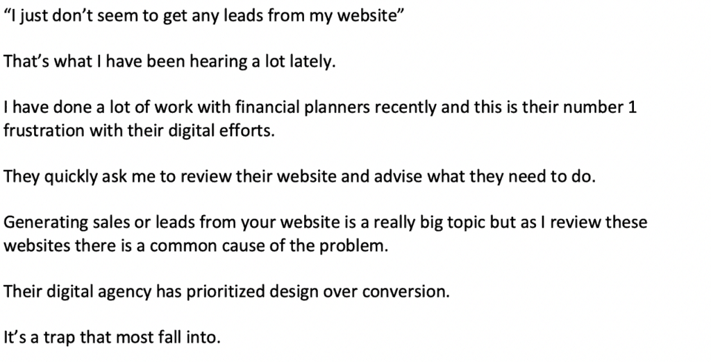
So, keep in mind the medium you are writing for and spread that text!
Problem #5: Stock Images
Stock images are those sometimes cheesy pictures of people attempting to look natural but we all know they are posing. You know what I mean!
You can break the world into two types of people: those that like stock images and those that don’t!
It seems like the people who like stock images are dominating web design at the moment.
I have seen home pages where there are multiple stock images that dominate the screen.
You just cannot do this. Too many stock images just make a website look contrived.
I’m not actually anti-stock images. Just follow these rules:
- they must be directly relevant to the topic. It’s ok to show an image of a beautiful beach if you are showing a tourist location. The image above of the wheat field definitely wasn’t relevant to financial planning.
- Make sure it doesn’t look fake with people doing poses. I’m sure you know what I mean.
- Don’t overdo them. 1 or 2 might be fine but don’t do more.
I really could go on with poor website design examples I see but I don’t want this to be 10,000 words.
When you start your next website redesign ask yourself these questions:
- What are customers looking for when they come to my website? I’ll have an article on this shortly.
- How can I convert my website traffic into leads? What value can I offer in return for customer data?
Website design is really important. The last thing you want is a visually boring black and white web page.
Just remember that the number one goal of your website is to generate leads. Don’t compromise lead generation for some fancy pictures that don’t mean anything.
In the war between Design and conversion I’m on conversions side.